The wait is now over, and once again this year the Pantone Color Institute has pronounced itself by decreeing the winning shade, the one that embodies the spirit of the times we live in, the one that will influence fashion, furniture trends, make-up, advertising, and design.
The proclamation of the pantone color of the year is a highly anticipated event. A tradition that has been renewed on time for more than two decades now and catalyzes the attention of even the uninitiated. The Pantone Institute is trend setter in terms of hues and color combinations, an authoritative source from which graphic designers, stylists, advertisers, and make-up artists draw heavily by calibrating their creations based on the institute's indications.
So let's find out what the color of the year is, what its significance is, and how best to incorporate it into living contexts.
COLOR OF THE YEAR 2023: AND THE WINNER IS...
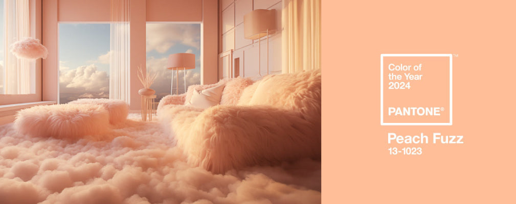
Peach Fuzz, with pantone code 13-1023, is a shade that expresses modern elegance with its warm and soft tones. The feelings it conveys are of love and sharing, a kindness that strikes to the heart and emphasizes the desire for solidarity with others.
The color of the year was not selected from the hues already in the Pantone color palette but created from scratch. And this was no accident: the choice of the color of the year in fact represents not only an exquisitely stylistic decision but yet another recognition of the expressive and communicative power of colors, now widely acknowledged.
Marketing has long referred to the psychology of color just as the principles of color therapy are finding more and more applicative space in everyday life as well: the choice of colors for the bedroom, the wall tint for the kitchen, the color matching of furniture. Colors speak through hues, communicate with their shades, converse with environments and those who live in them, conveying specific emotions and moods.
ARE YOU LOOKING FOR INSPIRATION TO LIVEN UP YOUR ENVIRONMENTS? LET YOURSELF BE CONQUERED BY THE CAPTIVATING COLORS OF THE LISOLASTORE PROPOSAL!
This year's pantone color is gentle and warm, inspiring solidarity and encouraging calm and a new approach to kindness. Gentle, romantic and at the same time the protagonist of a new modernity.
At a time when lives become more hectic and the turmoil multiplies, the search for simpler days and lasting peace grows stronger. New priorities are needed that focus more on inwardness than on productivity and external results, on the joy that brings people together, and on the importance of the inner self.
The message of the Peach Fuzz is filled with compassion and empathy, it is gentle and airy, reminiscent of classic and human tones, but also looking to modernity and the future with a gentle lightness.
CURIOSITIES
Peach Fuzz was chosen as the 25th anniversary Color of the Year; the first color was chosen in 2000 and was Cerulean.
For 2023, Viva Magenta had been chosen as a symbol of the common creative force and as a color with therapeutic and regenerative energy. For 2024, a calmer and kinder color was chosen instead, inviting one to stop and think about oneself and others, seeking inner peace before outer peace.
HOW TO INCORPORATE PEACH FUZZ INTO HOME DECOR
Unlike last year's Viva Magenta, Peach Fuzz is easy to use both on walls and as a decoration among other colors. The warm, romantic shades are ideal for creating cozy, relaxing atmospheres while still maintaining a modern elegance.
It can be used on walls or as an accent within a pattern; the tactile and soft feeling, that is recalled by the name itself, is ideal for a color that recalls the freshness of the summer fruit and the very warmth of hotter seasons.
When paired with soft colors such as other shades of pink (antique pink, pastel pink, rosy beige) its sweetness and tranquility is emphasized and conveyed with a sensual, but not aggressive, strength. Playing with contrasts, the ideal choices are dark blue and bottle green or yellow and anise, which are bolder and more energetic and, thanks to Peach Fuzz, stand out and convey the depth and determination needed in these times of turmoil to find peace.
WHAT ARE PANTONE COLORS?
So many of us hear about them but not all of us really know what is meant by pantone colors. Without getting too deep into technicalities, let's try to understand what pantone colors are and why they are so important.
In the early 1960s, a chemist working at Pantone (at the time a New Jersey printing company that created color charts mainly for the cosmetics and fashion worlds), realized that it was necessary to be able to uniquely identify a specific color so that printers and advertising agencies, designers, textile companies etc. could understand each other. Suffice it to say that each of us can recognize about 150 different hues that, depending on certain factors such as brightness and saturation, result in about 7 million colors!
Thus was born the Pantone System (Pantone Matching System): a code is assigned to each color by defining its exact ink composition needed to be able to reproduce it faithfully, so that the color you see on the "monitor" actually matches the final color of a design object, fabric, eye shadow etc.
The Pantone System has thus created a universal, standardized color language that makes it possible to immediately identify the thousands of shades that hues can take on. In short, a way to make sure that we speak the same language, a very powerful and fascinating language that, through our eyes, is able to convey emotions and thoughts.


